 |
|


 Dec 22, 2009, 08:29 PM // 20:29
|
#581 |
|
Desert Nomad
Join Date: Jun 2005
Location: USA
Guild: Kirins of Holy Light
Profession: N/
|

@ Operative I think the corner embellishments are a little too bright and just having 3 seems odd. Maybe scoot them more to the corners and dim them a tad? And I still think your trees are too smooth/straight edged. :-P The shadows being cast behind them look really good.
|

|

|
|
Dec 22, 2009, 08:32 PM // 20:32
|
#582 |
|
Site Contributor
Join Date: Jul 2008
Location: Dallas, TX. USA
Guild: Not in any guild at the moment
Profession: N/
|
Thank you so much Blue!!
I will practice the things you said on this picture to get them right before I draw something else. I did have a lot of difficulty drawing Dwayna's armor, metallic stuff is hard  I'll try drawing in the things you said, and post the results. ^_^ I'm very happy also that you like my pic otherwise, it's a big compliment coming from an artist like you. Again, thank you very very much! |
|
|
|
|
Dec 22, 2009, 08:54 PM // 20:54
|
#583 | |
|
Sins FTW!
Join Date: Mar 2005
Location: USA
Guild: Angel Sharks [AS]
|
Quote:
@ Operative: I was going to say that they are a bit too far from the corners and take away from the piece. I think they are really cool looking, but I find them not necessary since you have a strong foreground and background. I liked the picture before you added them personally. With them it feels more like a postcard (which is fine if that is what you are going for) but without them it really lets the scene speak for itself and feels a bit more real (which is my preference). I am also glad you didn't add the elf and grentch cause I think that would've taken away from the wintery serenity of the piece. I do have some concerns with the lighting/shadows on the snow though, specifically the dark patches to the right of the lady. It seems a bit too dark and diagonal and doesn't really capture the light of the tree illuminating any ridges of small snowbanks and the like. Maybe it's just because the light of the tree is so strong and the rest of the piece has a lot of heavy shadows to it. Not sure exactly, but maybe some highlights need to be brightened a bit to help capture the tree's light illuminating the edges of objects closer to it. I love the baby trees amongst the grown up ones. It really makes the scene feel more realistic. I also love Dwayna as the ornament for the top of the tree, but I feel her light isn't quite as strong as the tree's. To me I would picture her as bright as, if not brighter than, the tree. It could just be that the tree's light is yellow which makes it stand out a bit more as Dwayna seems to have a more white glow about her.
__________________

Last edited by Kha; Dec 22, 2009 at 08:59 PM // 20:59.. |
|
|
|
|

|
Dec 22, 2009, 10:00 PM // 22:00
|
#584 |
|
Site Contributor
Join Date: Mar 2008
Location: UK/norway
Guild: Order Of The Etherbloom Crown [ZEN]
|
- a couple of people have contacted me repeating their info for the "artists and their progress" list, since I've managed to overlook them. So I repeat, please, if you're name is not on your list and you want it there, repeat the short entry info in a PM or a post here so I can add you. Also, if you've got a progress gallery and no link to it in your info on page 1, and you want one there, please post an url to it here.
- Thanks so much to Mr. Frozenwind for getting the Workshop featured in the news update at www.guildwars.com!  - added myself back on the list so a link to the blog is available still, for those who're interested. Last edited by Tzu; Dec 22, 2009 at 10:03 PM // 22:03.. |
|
|
|
|
Dec 22, 2009, 10:21 PM // 22:21
|
#585 |
|
Forge Runner
Join Date: Nov 2006
Location: Arizona, USA
Guild: [OOP] Order of the Phoenix I
|
Thanks guys.
I think the corner embellishments are a bit much as well. I have this as my desktop background so I can't help looking at it and as the originating artist I (hopefully) pick it apart and see all the glaring little flaws. I agree with you guys after stepping away from it for a while, the embellishments are too much and I don't think they fit the theme of the picture anyway. I agree on the foreground shadows. I don't think you can make it out at all, but the moon is up in that little wisp of clouds you can see through the branches in the upper left (as seen here, but mirrored). Those shadows were originally meant to be from the moon, but I think the brightness of the tree's aura would override them. I think it worked before I added such a bright glow around the tree, but now they are waaay too dark considering the ambient light in the scene. Definitely tone them down a bit. Oh, and definitely make Dwayna a little brighter.
|
|
|
|
|
Dec 22, 2009, 10:30 PM // 22:30
|
#586 |
|
Sins FTW!
Join Date: Mar 2005
Location: USA
Guild: Angel Sharks [AS]
|
@ Operative: Yeah, I noticed the bright clouds and could tell there was moonlight in the sky. I thought it was a nice little touch instead of just having a dark sky. If anything, the moonlight would add a bit of a glow on the edges of the tree branches at the top since there aren't a lot of gaps for it to enter the small clearing, and most of the clearing would have the overpowering light of the tree as its source. Once those shadows are fixed, the picture will really come together I think. I look forward to seeing it done
__________________
|
|
|
|
|
Dec 23, 2009, 03:33 AM // 03:33
|
#587 |
|
Ascalonian Squire
Join Date: Nov 2005
Location: Yak's Bend (pacific coast, us)
Guild: Orphans of Kukai
Profession: R/N
|
@Verene: I'm just glad you did point it out. I resubmitted this morning with Arenanet. I can't imagine they would have a problem replacing the old file with the new. I'm so pleased you liked the book cover idea.
@Countess: I'm so pleased you like it. Thanks! @Shy Guy: Nice montage you have going there. You might think about adding some contrasting color to some items where you want to add interest and focus the viewer's attention. Perhaps making the presents orangish gold as well as Dwayna's crown and outfit @Operative 14: Thanks so much and wow, I loved Clone Wars the movie. I guess I must have been influenced by it subconsciously. I'd like to read the book too. I wonder if I can find someone to write it? Your piece is coming along quite nicely. I like the sense of balance between the figures and the tree. |
|
|
|
|
Dec 23, 2009, 03:42 AM // 03:42
|
#588 |
|
Desert Nomad
Join Date: Jun 2005
Location: USA
Guild: Kirins of Holy Light
Profession: N/
|
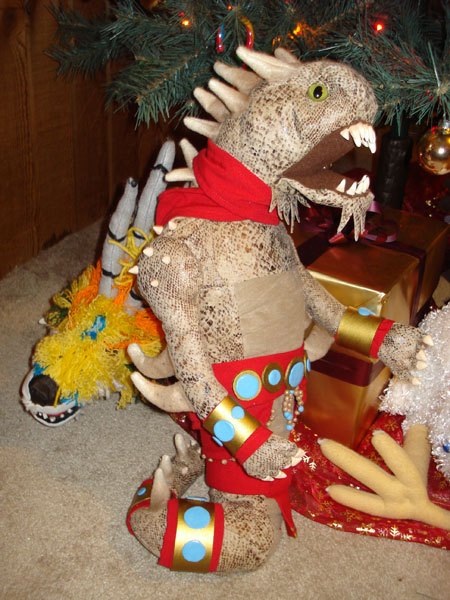 Thats about as done as the naga is going to get. I'm not too happy with how it turned out but it will have to do. Now to rearrange the ornaments and take my final pictures. |
|
|
|
|
Dec 23, 2009, 05:48 AM // 05:48
|
#589 |
|
Forge Runner
Join Date: Nov 2006
Location: Arizona, USA
Guild: [OOP] Order of the Phoenix I
|
Here's an update to mine. Adjusted the foreground shadows, brightened Dwayna up a bit, and made the snow on the ground look a *little* more powdery.

|
|
|
|
|
Dec 23, 2009, 07:32 AM // 07:32
|
#590 |
|
Krytan Explorer
Join Date: Jul 2006
Guild: Shiverpeaks Search And Rescue [Lost]
Profession: W/
|
Much much better there. The shadows were a bit overbearing and took away from the emphasis.
|
|
|
|
|
Dec 23, 2009, 01:26 PM // 13:26
|
#591 |
|
Sins FTW!
Join Date: Mar 2005
Location: USA
Guild: Angel Sharks [AS]
|
@ Kiya: That naga came out really good. You should be happy with how it turned out. He's cute
I can't wait to see Yakkington done; I think he's my favorite so far from the progress image you had of them all.
__________________
|
|
|
|
|
Dec 23, 2009, 02:07 PM // 14:07
|
#592 |
|
Desert Nomad
Join Date: Jun 2005
Location: USA
Guild: Kirins of Holy Light
Profession: N/
|
@ Operative. Shouldn't the tree shadows on the ground be at different angles? They dont seem to be matching where the large light source is coming from, especially the closest tree.
|
|
|
|
|
Dec 23, 2009, 02:41 PM // 14:41
|
#593 |
|
Furnace Stoker
Join Date: Jun 2005
Guild: gwpvx.com/user:dzjudz
|
Another update from me. I'm starting my story in the forest now as tmakinen suggested. In screen 3, I have to add in another Grentch or two in the background and of course Grenth next to the tree. I have a raw sketch of screen 4 but I won't do that to your eyes (remember the first drawing I submitted in this thread?
 ). ).Again, I'd like to ask for suggestions on how to draw the wall in the rabbit hole. Drawing Dwayna and keeping her consistent throughout the screens was definitely the most difficult task so far. Time consuming is an understatement for a novice such as myself. Anyway, I'm ready for your comments and criticism .
|
|
|
|
|
Dec 23, 2009, 02:44 PM // 14:44
|
#594 |
|
Academy Page
Join Date: Dec 2009
Location: GMT
Profession: W/
|
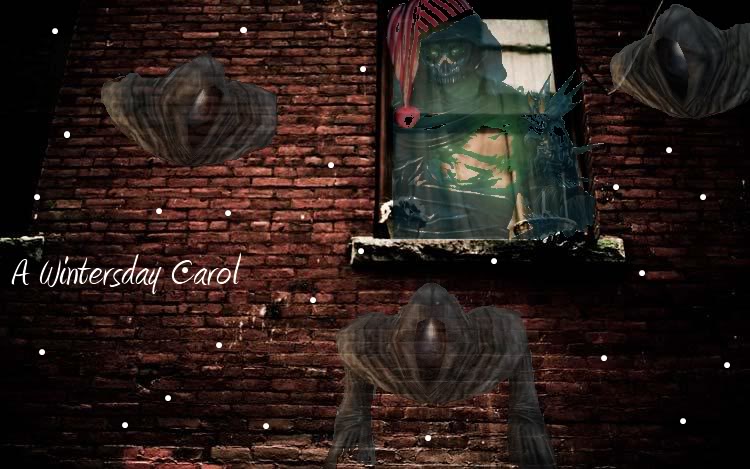 Any CC appreciated. Last edited by Mobiusman; Dec 24, 2009 at 12:23 PM // 12:23.. Reason: link |
|
|
|
|
Dec 23, 2009, 03:52 PM // 15:52
|
#595 |
|
Sins FTW!
Join Date: Mar 2005
Location: USA
Guild: Angel Sharks [AS]
|
@ Dzjudz: It's coming nice. I like that it's a comic kind of entry that tells a bit of a story. My suggestion for the wall is to add texture to it. I forgot what you were using to draw this in. Photoshop or something? Just find a brush that gives a kind of sprayed effect and dot around the wall to almost make it look rocky, if that makes sense. Even Paint has a spray brush and I remember using it to add texture when I started drawing on the computer as a kid, hehe. Also making the base color of it darker than the ground would help it be separate as just the lines are kind of distracting. Could still keep the lines, but maybe make them not as dark so there's a difference between those lines and the lines that separate the ground and the walls. I also suggest even adding simple shadows beneath the characters and objects so it gives them some weight and makes them look like they are actually on the ground.
@ Mobiusman: I like your idea a lot. My favorite part has to be the ghost at the bottom. It's nice to see his arms and his direct on positioning almost makes it look like he's coming out right at the viewer. I find the ghost in the top right though a bit disconnected from the rest of the piece, probably because the wall behind him is so heavily in shadows that he doesn't have quite the transparent effect as the others. My suggestion might be to try to position him on the other side of the window, which probably means rearranging the one in the top left, then just crop off a bit of the side where the right one was. He looks to also be a mirror of the other ghost. If that's so, maybe try to get a third different picture just to have different bits of their upper bodies showing especially if you put them next to each other. The text is a bit too close to the left side. You should push it a bit more to the right, possibly centering it between the left side of the image and the edge of the window. Also making it a bit bigger might help if it's going to be the only text in the image. Dhuum and his hat don't look as cleanly cut out as the wraiths; I can see bits of white along the edges. I suggest going back and just cleaning that up. Also, I find Dhuum a bit confusing because it seems like he is inside the building since his left side is blocked by the wall, but his right side and the cap overlap the building and plants on the windowsill. I suggest cropping him so the hard parts of the window and the wall block out the bits of him that overlap, leaving only where there's glass for us to see him. Or try to find a balance of what part of him are inside and what are sticking outside if you want, because for example if the bottom left of the window/wall is blocking him, then the plant on the windowsill should be too. And it seems like chunks of Dhuum are missing, like the lighter parts maybe were cut out in removing his image from the original (the same with the cap). Could either try to recrop the original image, or fill in the gaps with a lighter color of Dhuum and keep it transparent like the rest of him so it provides some obscurity to the inside of the building. I like the bits of snow too, but would try to have a few different size circles and a bit more. Or if you can find snowflakes to resize. Will especially be helpful to have more, particularly actual snowflake ones, to fill in the gap between characters if you don't plan on adding any other items because then the falling snow can be like small decorations throughout the image. Hope that helps and made sense.
__________________
Last edited by Kha; Dec 23, 2009 at 03:55 PM // 15:55.. |
|
|
|
|
Dec 23, 2009, 04:18 PM // 16:18
|
#596 | |
|
Furnace Stoker
Join Date: Jun 2005
Guild: gwpvx.com/user:dzjudz
|
@Mobiusman: I agree that the bottom ghost looks best. It looks most like it's popping out of the wall towards the viewer. I think the lines on Dhuum are too jagged and harsh. What program are you using for the drawing? Also, I'd make more snowflakes of different sizes. Having them all the same size doesn't look right.
Quote:
|
|
|
|
|
|
Dec 23, 2009, 08:32 PM // 20:32
|
#597 |
|
Desert Nomad
Join Date: Nov 2005
Location: www.mybearfriend.net
Guild: Servants of Fortuna [SoF]
Profession: E/
|
I submitted my entry today. Since I'm going away for the holidays I'll post the final version (well, at least a scaled down one since the original is 4560x3040 pixels) here now (and welcome any and all comments, positive or negative) and wish you all a very merry Wintersday
(And yes, those are real puppets, not computer generated cruft.) tmakinen of [SoF] Edit: oh, and here's the project page
Last edited by tmakinen; Dec 23, 2009 at 08:36 PM // 20:36.. |
|
|
|
|
Dec 23, 2009, 08:35 PM // 20:35
|
#598 |
|
Furnace Stoker
Join Date: Jun 2005
Guild: gwpvx.com/user:dzjudz
|
Wow. Just, wow. Great work.
|
|
|
|
|
Dec 23, 2009, 08:37 PM // 20:37
|
#599 |
|
Desert Nomad
Join Date: Jun 2005
Location: USA
Guild: Kirins of Holy Light
Profession: N/
|
I am in awe.
|
|
|
|
|
Dec 23, 2009, 08:41 PM // 20:41
|
#600 |
|
Furnace Stoker
Join Date: Dec 2006
Guild: [Bone]
Profession: Mo/
|
That looks stunning Tmakinen. Just wow. And so many :O Definatly a prize winner!
Anyway here is my progress. Supersaiyen Morag casts her evil snowball at Verene 
|
|
|
|
 |
|

«
Previous Thread
|
Next Thread
»
| Thread Tools | |
| Display Modes | |


 Linear Mode

|
|

All times are GMT. The time now is 05:59 AM // 05:59.
